


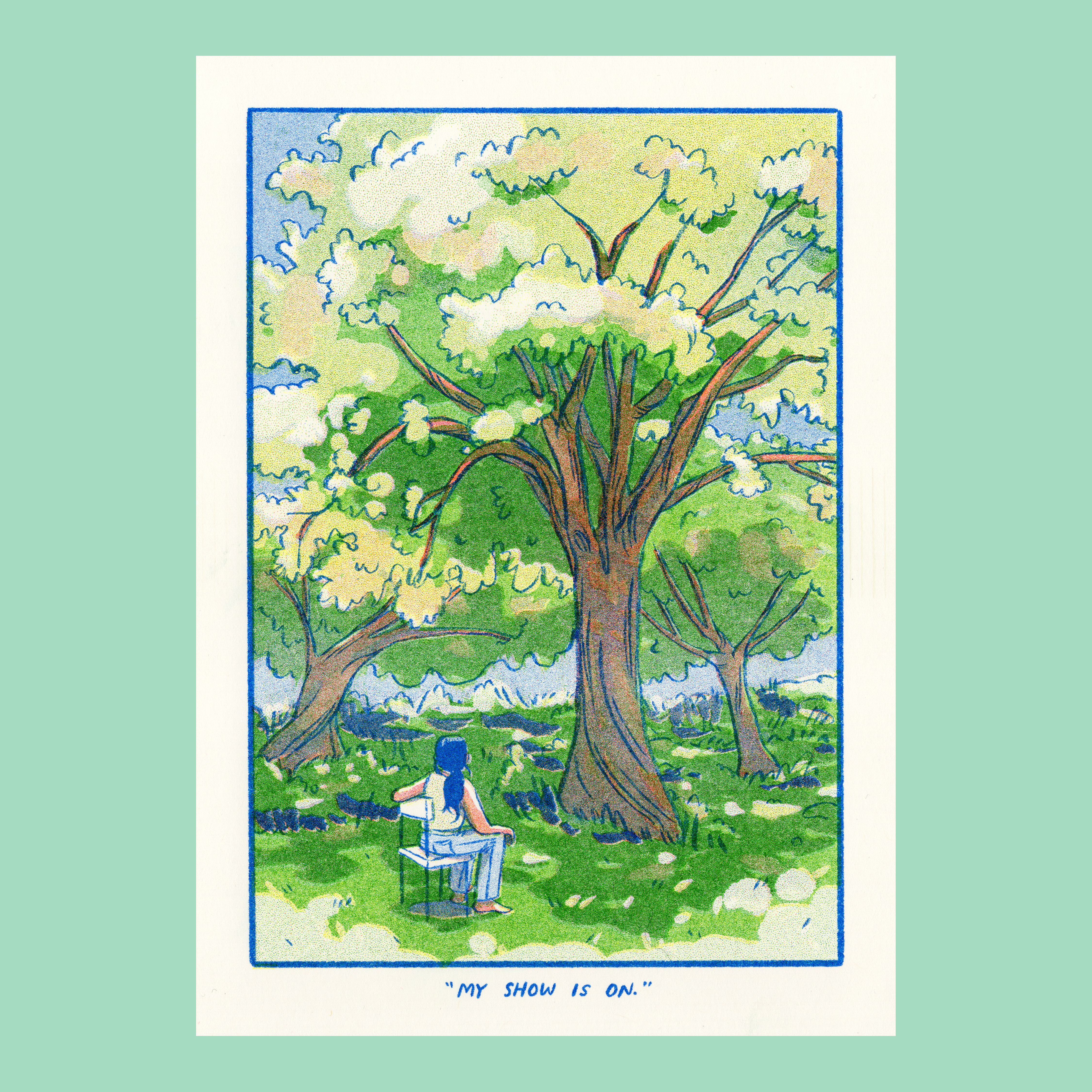
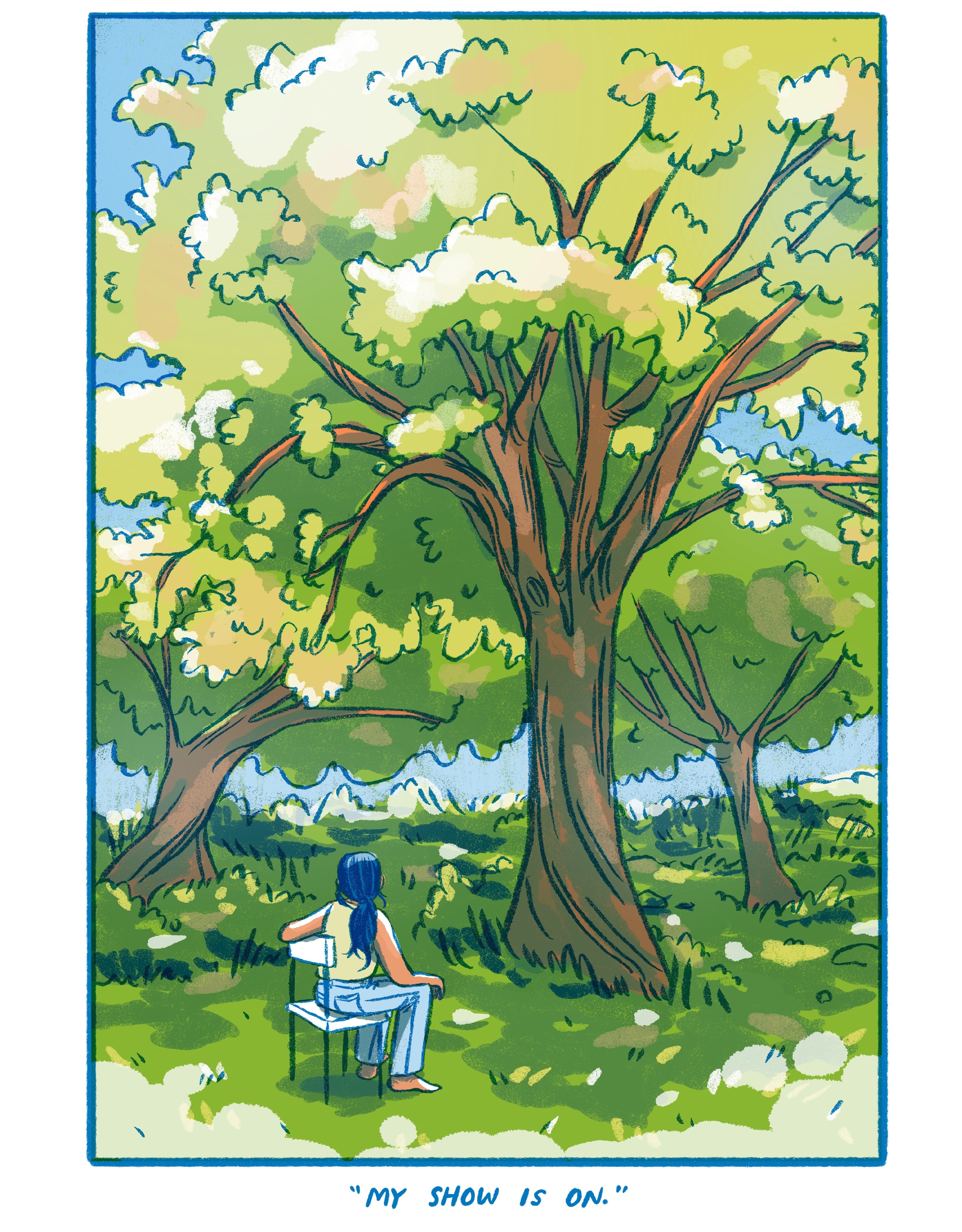
May's Riso Print / "My Show is On."
hoo boy! nature, amiright?

Usually I save this kind of process post for my paid subscribers, but I thought I’d make today’s post public as an example. If you’re interested in the in-depth details of my risograph printing, this post is for you! And I’m always an open book if anyone ever has questions about my drawing or printing process – feel free to leave a comment :)
Every month I make a risograph print in my little home art studio to send out to my lovely Patreon Riso Club members! It’s basically a monthly art subscription, with some bonus behind-the-scenes content about what I’m working on and how I make riso prints.
Print Details
65lb cover weight natural paper
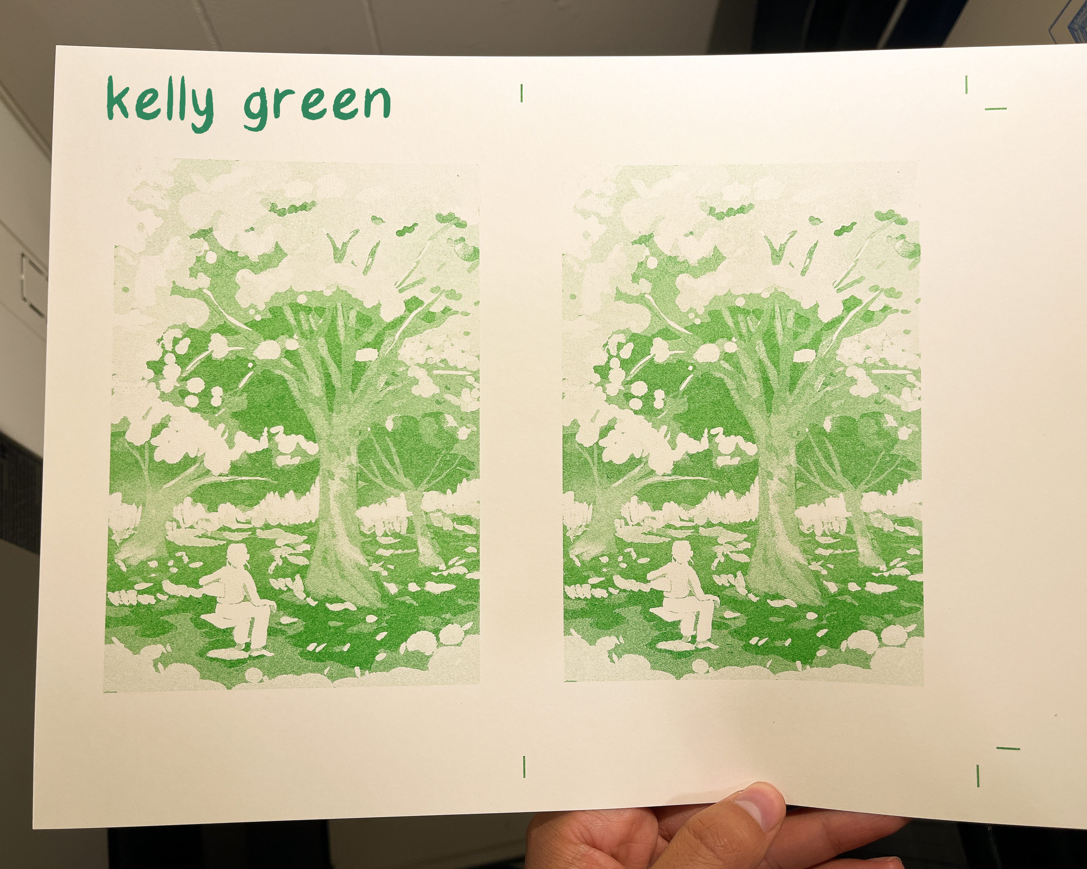
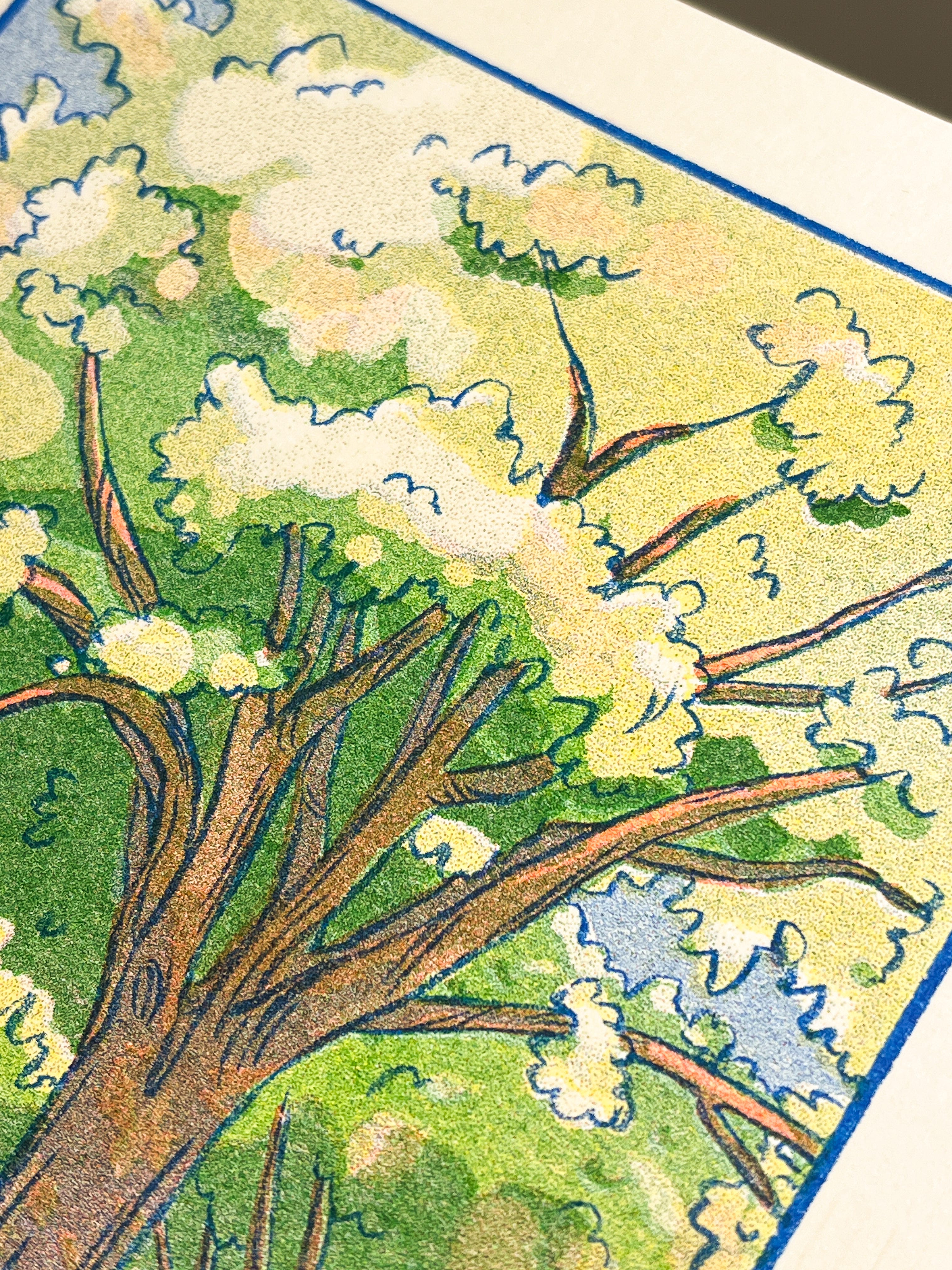
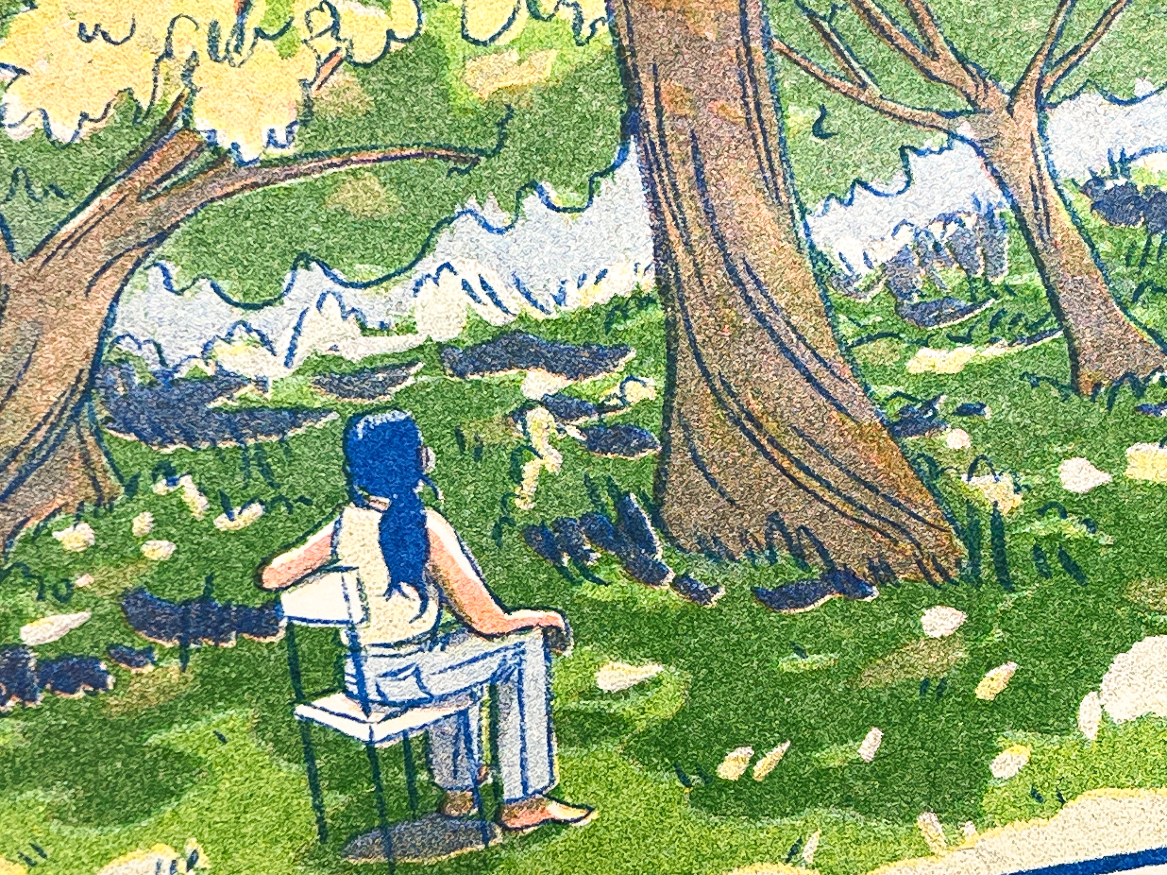
4 ink layers: Kelly Green, Scarlet Red, Yellow, Blue
5x7”
Inspiration
I mean, this print is inspired by Spring and all the new leaves on the trees, etc. etc. etc. That's obvious, right? The seasonal depression is lifting, and other forms of doom are taking its place! (Kidding, not kidding.)
I fear that the sentence "my show is on" is such an internet phrase right now... In case you're blissfully unaware, it basically means refers to happily watching/observing something as though as it's a television show. In this particular case, I feel absolutely content to sit and watch nature at this time of year, especially because it feels so new.
It just so happens that it's exactly the time of year where I start whining about living in a city and not closer to more nature. Like clockwork!! I'll get over it once October/November hits.
Drawing Process
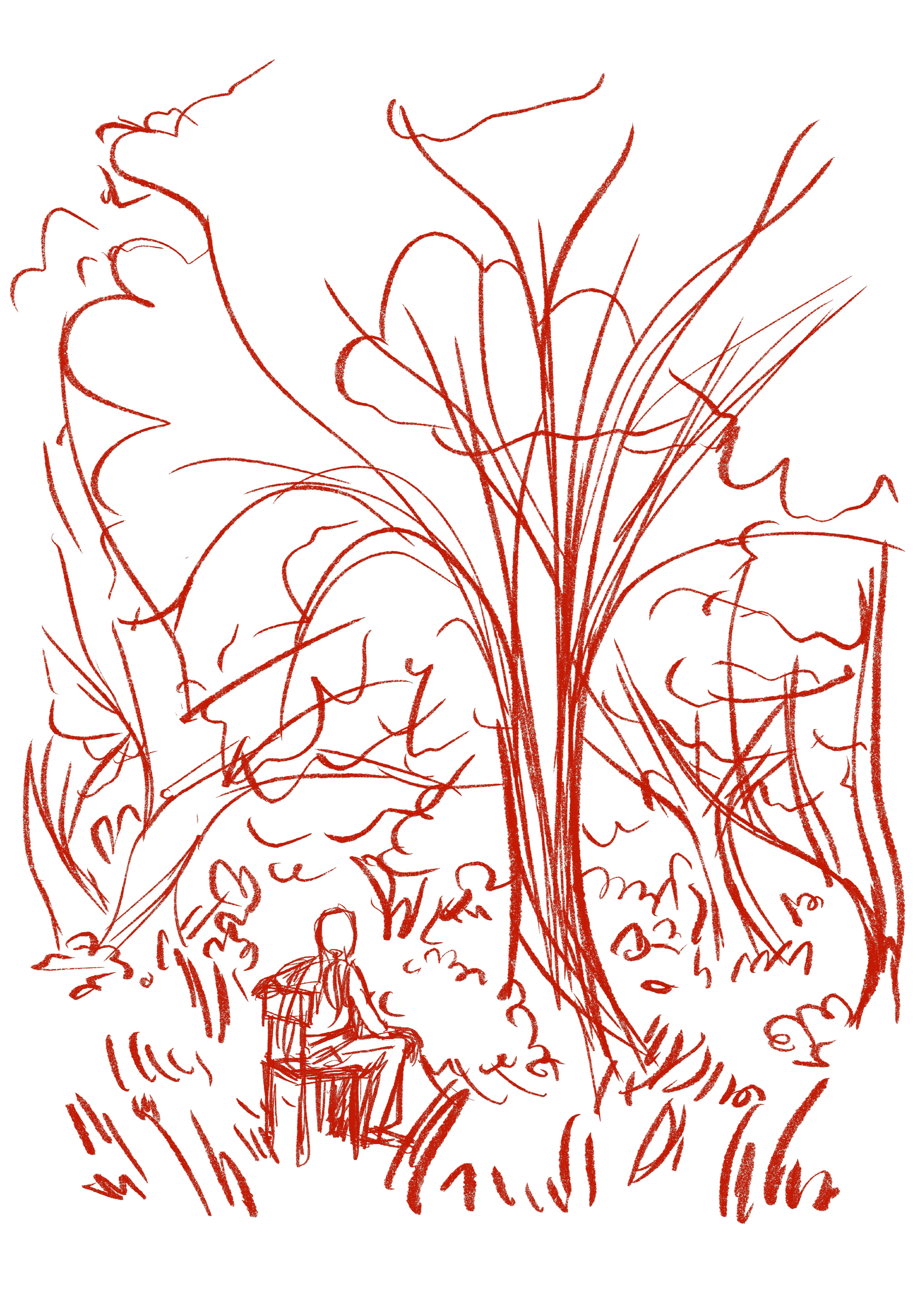
Here's my initial rough sketch, drawn in Procreate:
Finished line art:

A gif of my coloring process:

I've been wanting to practice drawing trees – they're tough! There's gotta be a YouTube tutorial out there that I should watch.
I did have fun with coloring this. I tried to keep it loose and painterly, with an emphasis on the contrast between highlights and shadows. I always forget that the Riso machine really works it magic when it comes to watercolor-esque digital paintings.
Printing Process
The free app Spectrolite once again came in handy in helping me split my image into different color layers:
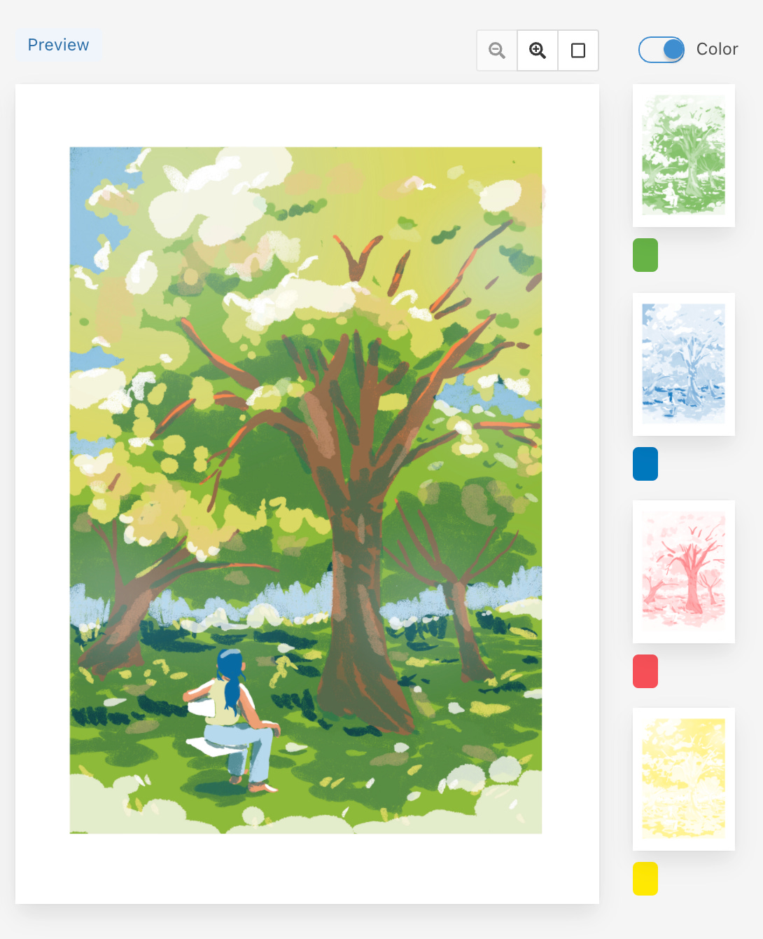
I add the linework layer manually when I'm ready to print, mostly because Spectrolite will add the line art to every single color layer, and it's very difficult to line up thin lines perfectly every time when printing.

I rarely every use the Kelly Green ink drum that I own. I'm not sure why! Maybe because it tends to be a cooler color, and I gravitate towards warmer color palettes? Or maybe it's because I can achieve a similar color by mixing together Blue and Yellow ink layers, which I usually always use anyway? I do think that using a base layer of Kelly Green added a depth to the colors that I wouldn't be able to achieve otherwise.
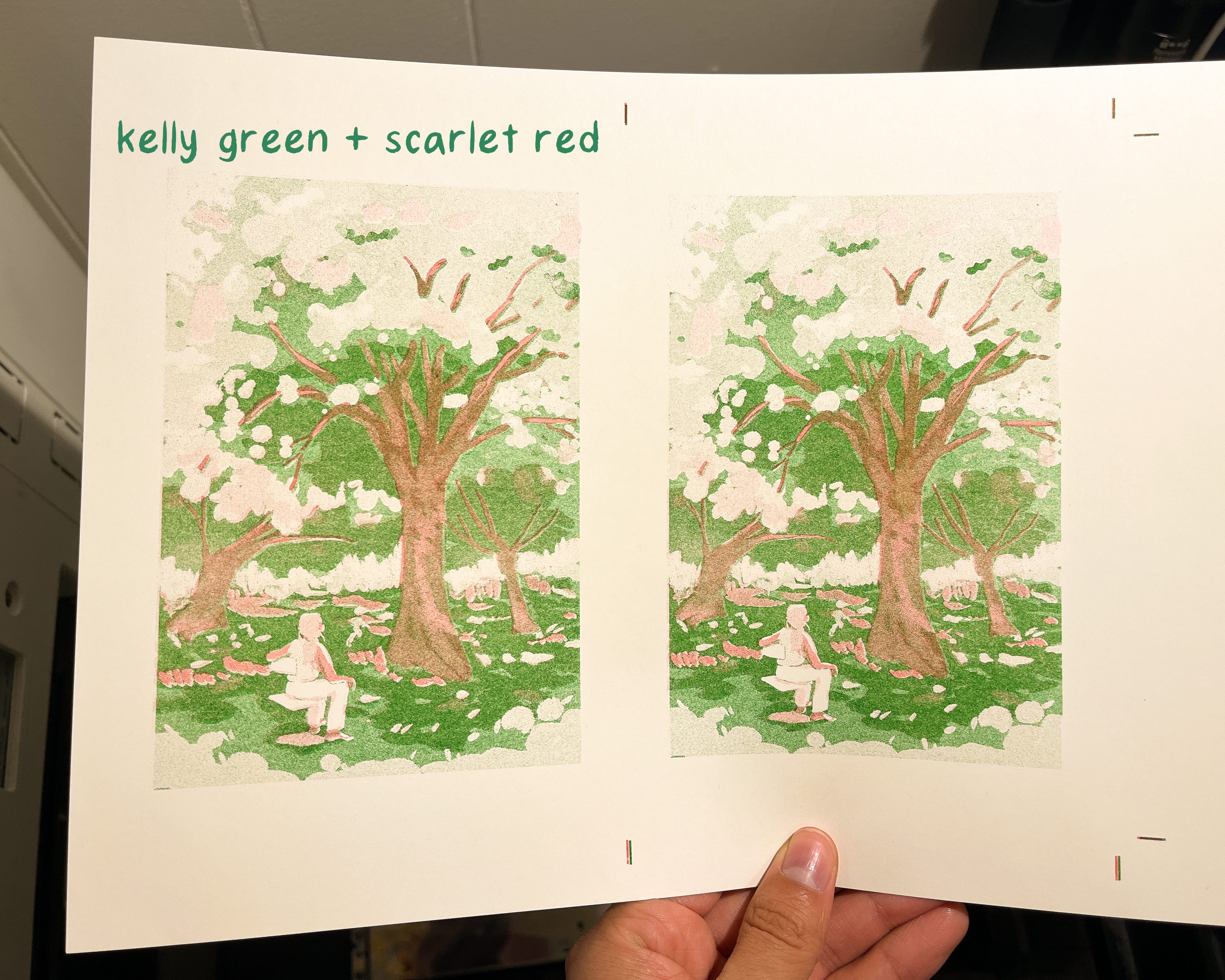
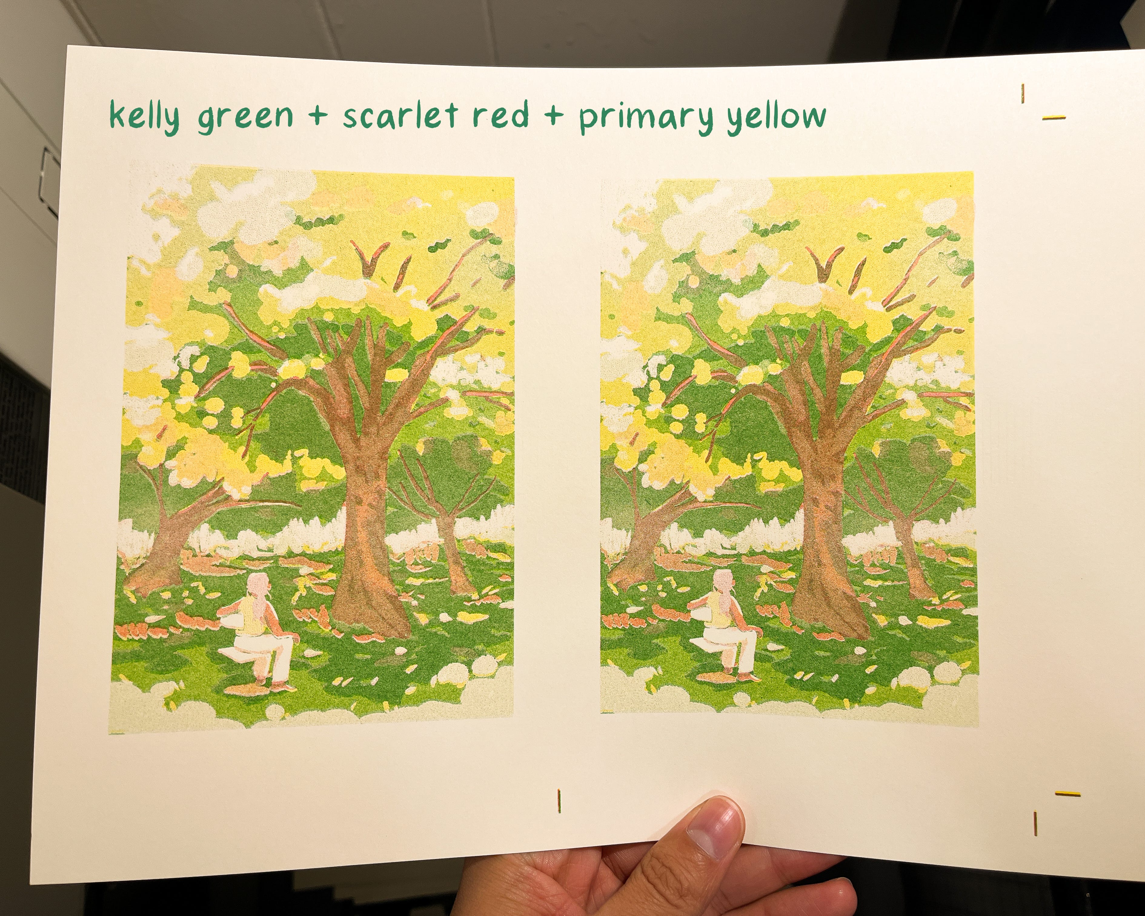
I printed in this color order: Kelly Green -> Scarlet Red -> Yellow -> Blue.
Here's my rationale:
Blue had to be last because it was the layer that contained the line art, and it would look muddy if it had 3 other layers on top of it.
Yellow had to be second-to-last because Yellow tends to blend best when layered on top of the other colors.
If possible, Scarlet should never be printed first because it has a tendency to really smudge a lot when sent through the machine too many times. So second layer it is!
Green was the first layer to be printed, mostly so that I could control how dark it was, especially because I was nervous about it becoming too muddy if the ink printed too heavily.

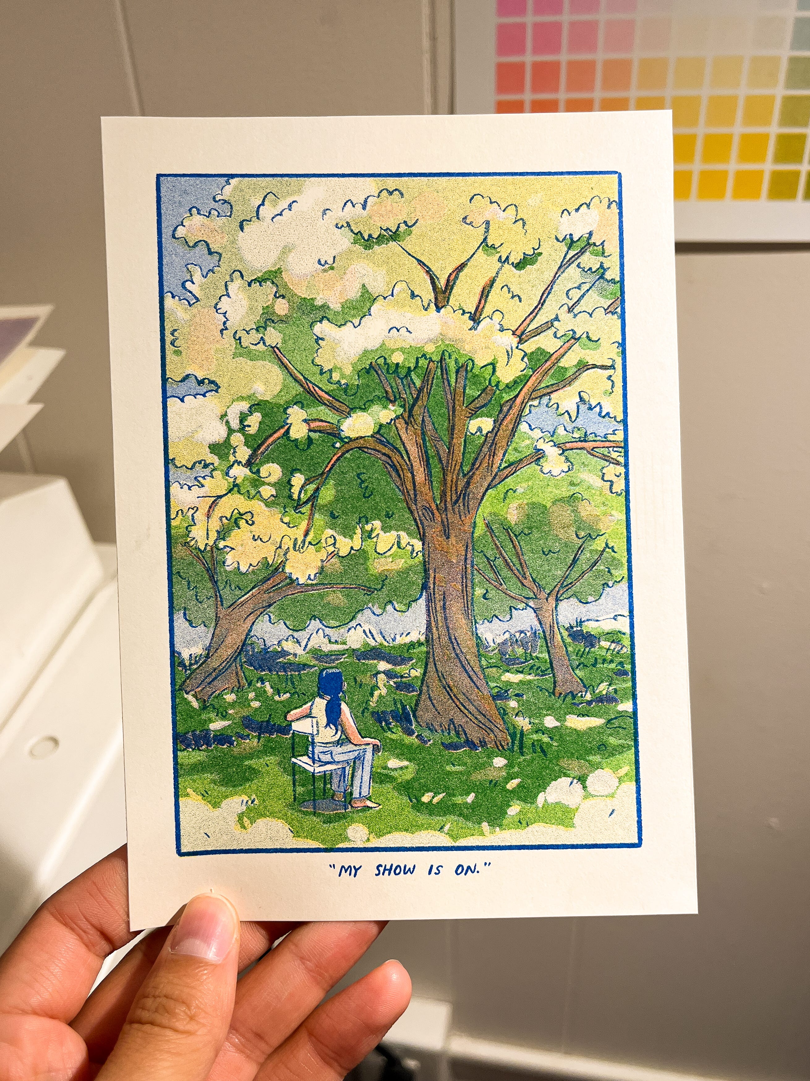
Once again, for comparison, here's the digital version that I drew in Procreate:
Close-Ups
As usual, sign up for the Riso Print Club tier by May 31st if you'd like me to mail this to you! I'll be sending these prints out on a rolling basis through the end of the month :)
thanks for sharing! your work comes from such a beautiful place.
Thank you! So cool to see your process! Spectrolite makes it seem possible :)